User Experience, or more commonly referred to by the initials UX, isn’t exactly new, even though it’s been getting a lot more attention lately. Honestly, it’s been a big part of design discussions for ages. Initially, UX was about making sure products were easy to use, focusing on basic usability. The goal was to create something easy to navigate, simple to read, and that works smoothly. Could you find what you needed? Was it readable? Did it work smoothly? It was about getting the job done without too much hassle.
As tech got better and digital products became more advanced, it quickly became clear that just being functional wasn’t enough. This realization marked a turning point for UX in app development. The focus expanded beyond mere usability to include the emotional and psychological impact of a product on its users. Modern UX design is focused on creating something that feels right, something that resonates with the user on a deeper level.
In this article, we’ll dive into why User Experience is such a big deal in app development, why it should matter to you as well, and how we at CodingIT work to deliver the best results possible when it comes to UX design.

UX/UI A Symbiotic Relationship
It’s tough to talk about User Experience without mentioning User Interface (UI)— they’re pretty much inseparable. They’re deeply intertwined, working together to create a product that’s not just functional, but also visually appealing and easy to use. UX is the foundation, the part you don’t see, but the one that holds everything together. The research, the strategy, and the structure shape how the product feels to the user. UI is the part you do see. The look, the layout, the interactive elements that catch your eye and invite you to engage.
Think of them like an iceberg. The massive chunk beneath the water is UX, doing the heavy lifting by supporting the user’s journey and ensuring everything makes sense. Above the surface, the tip of the iceberg is UI—sleek, polished, and designed to grab attention. Without that solid UX base, the UI would have nothing to stand on, and without a beautiful, intuitive UI, all that hard work on UX might go unnoticed. This relationship is vital because one can’t truly shine without the other.
Why is the UX Design Strategy Important?
At its core, UX is about understanding users—how they think, what they need, and why they interact with a product in a certain way. This kind of understanding is the foundation of good design.
The UX design strategy is the blueprint for building a great product. It starts with gathering crucial information that helps you see the bigger picture. You need to know what the user needs, why they need it, and how they’re currently trying to meet those needs. Once you have this clarity, everything else starts to fall into place. You can then begin to map out who your users are, what challenges they face, and how your design can make their lives easier.
The User-Centered Design Process
That is the top 1 priority when designing the UX. Understanding the people who will actually be using your product. It doesn’t matter if you are building a car or you are creating custom software, the priority remains the same.
This approach digs deep into the needs, behaviors, and challenges of your target audience. The process usually kicks off with some good old-fashioned UX research. Designers have many UX research methods to gather data: user interviews, surveys, and observation. All ways to really get to know who the users are and what makes them tick. The end goal? To create detailed user personas that capture the essence of different audience segments. These personas help designers step into the users’ shoes, anticipate their needs, and ensure the final product truly connects with its intended audience.
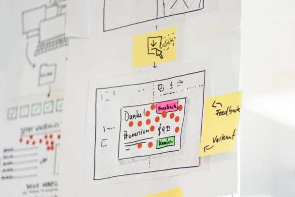
Once these user personas are in place, the fun part begins—ideation and prototyping. This is where designers start brainstorming ideas, sketching out wireframes, and building prototypes that can be put to the test with real users. It’s an iterative process, meaning testing, getting feedback, and refining the design over and over until it’s just right. Each cycle of feedback helps to polish the product, making it more aligned with what users actually want and need.
What’s great about this user-centered approach is that it keeps the focus exactly where it should be—on the user. Every decision made during the design process is done with the user’s experience in mind. It’s more than creating something that works. By continuously testing and refining, we can ensure that the final product is enjoyable and intuitive.

Collaboration in UX Design
Great UX design doesn’t happen in a vacuum. It’s a team effort that brings together the skills and insights of developers, project managers, and clients. It’s a process that thrives on collaboration, where different perspectives come together to build something better.
This is where the Agile methodologies kick in. This method helps us stay flexible, get constant feedback, and keep moving forward. In an Agile environment, UX engineers work hand-in-hand with developers, ensuring that their design ideas are not only user-friendly but also technically feasible. Regular sprints and daily stand-up meetings keep everyone in the loop, making it easier to tackle challenges as they arise and pivot quickly when changes are needed.
Here, this cross-functional collaboration has been kind of the secret sauce to our successful UX design. One of the standout aspects of our process is the exceptional communication between our UX designers and developers. The experience and expertise that our developers bring to the table are evident in every stage of the design process. They have a deep understanding of what it takes to turn a concept into a fully functional product, and that understanding makes working with them incredibly smooth.
User Testing and Feedback
By putting the app in front of real users and watching how they interact with it, we get invaluable insights that help us understand what’s working and what needs a little more love. There are different ways to go about this, whether it’s A/B testing, usability testing, or remote testing, each way gives us a different piece of the puzzle.
The feedback part of the process is where improvements shine. You could think that dealing with constant tweaking and adjustments could be tiring, but the truth is that feedback is golden. Even if it’s not always what we want to hear. In fact, some of the most valuable insights come from those moments when something doesn’t quite work as planned. It’s all part of the process. We don’t avoid it; we embrace it. We know that every bit of feedback, whether it’s a minor change or a major overhaul, brings us one step closer to creating the right product.
UX Desing Tools
Figma, Sketch, and Adobe XD are some of the tools UX designers usually go for when creating wireframes and prototyping. It is because they are packed with powerful features that make their job so much easier. Figma, in particular, has really taken off because of its cloud-based platform. This allows UX designers, UX engineers, and developers to work together in real-time, keeping everyone on the same page and making sure the project stays on track.
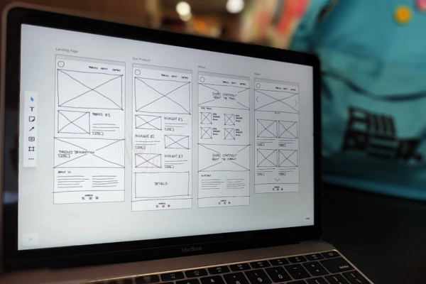
The typical design workflow starts with low-fidelity wireframes. They give everyone a basic idea of how things will be laid out without getting bogged down in the details. Once the basics are nailed down, these wireframes are transformed into high-fidelity prototypes that include all the detailed design elements and interactive features.
We rely on tools like Figma because they make this iterative, collaborative process so much easier. For instance, our developers can see everything they need—pixel measurements, typography, colors, and more—right alongside the designs. This kind of transparency ensures that the transition from design to development is as seamless as possible. By starting with strong wireframes and iterating our way to high-fidelity prototypes, we’re able to create apps that look great, work well, and deliver an outstanding user experience.
Mobile-First Design Considerations
As it is quite clear by the name, mobile-first design starts with the mobile experience and then scales up to larger screens like tablets and desktops. This makes perfect sense because, let’s face it, mobile devices are now the main way people interact with content.
During this process, we pay special attention to the responsive design. Meaning, that your app will adapt seamlessly to different screen sizes and orientations, ensuring that users have a consistent experience no matter what device they’re on. But let’s clarify something, mobile UX isn’t just a mini version of desktop UX. There are some real differences to consider, like the need for touch-friendly interfaces and simpler navigation. On mobile, for example, users often scroll both vertically and horizontally, so it’s important to design intuitive scrolling experiences that feel natural.
We are confident that focusing on mobile-first design is the best way to create apps that are not only accessible but also user-friendly, whether someone’s using a phone, tablet, or desktop. By starting with mobile, you’re setting the stage for an app that works beautifully across the board, ensuring that users have a smooth, enjoyable experience.
Dark Patterns
Dark patterns in UX design are those sneaky tactics that, whether intentionally or not, end up manipulating users into taking actions they might not have intended. They tend to benefit the app or web owner, but never the users. These can be things like making it incredibly difficult to find the button to cancel a subscription, using vague or misleading language to confuse users, or designing interfaces in a way that nudges users toward a choice that benefits the business rather than the user.
While these tactics might deliver short-term wins for the business—like retaining customers or boosting sign-ups—they come with a hefty price. Our UX engineer, Ziv Paczy, highlighted that these dark patterns create friction, frustration, and ultimately erode the trust users have in your brand. Users might tolerate it once, but over time, these practices can lead to a negative reputation, as people increasingly value transparency and straightforwardness in their digital interactions.
Having an ethical design is particularly important in the long game. While dark patterns may seem tempting for some to achieve immediate business goals, they’re not sustainable. As users become more aware of these tactics, they’ll start to push back. In contrast, those who adopt ethical design principles will foster trust and loyalty, leading to higher engagement and a stronger, more positive brand reputation over time.
Our Thoughts on UX
Right now, you really can’t overstate how important UX is. From understanding user needs to creating intuitive interfaces, every step of the UX process is designed to ensure that the final product not only looks good but truly works for its users. Without a well-thought-out UX strategy, you’re essentially flying blind. You might have a sleek UI and some innovative ideas, but if they’re not grounded in a deep understanding of your users, the final product might fall flat.
At CodingIT, we make it our mission to dig deeper, to understand not just the “what” but also the “why” behind user behaviors. This approach allows us to create products that connect more profoundly. So, if you’re serious about delivering top software solutions that truly resonate with your users, it’s time to partner. Contact us and let’s create something exceptional together.
