
Across the tech industry, dashboards are filled with vanity metrics that look like progress. Upward trends, spikes in activity, weekly growth rates. There’s always something to celebrate, and some lines are going in the “right” direction. The team’s shipping. The users are clicking. The charts are moving. And yet, the product isn’t.
Somewhere along the way, forward motion became a performance. Something we measure in numbers that don’t demand too many questions. Numbers that look great in status meetings and OKRs, but don’t reflect whether anything is working.
This is more common than most teams are willing to admit. Not because anyone is trying to fake success, but because this version of success is easier to manage. Easier to track. Easier to explain. And so, teams keep building. Keep optimizing. Keep moving.
Until the movement itself becomes the goal. When that happens, product strategy turns reactive. Roadmaps start serving the metrics instead of the users. Decisions feel fast but disconnected. Everyone is busy, but not necessarily better.
This isn’t a failure of execution. It’s a failure of focus. And the most dangerous part is how normal it all looks.
Blog Summary:
This isn’t another blog post telling you to “be more data-driven.” If anything, it’s about understanding how the wrong data creates the wrong momentum. Here you will discover:
- Why “up and to the right” often means you’re looking at the wrong graph
- How shallow metrics creep into your roadmap without anyone noticing
- What good metrics look like
- Why teams drift when data drives the conversation
- The mindset shift that changes how you measure progress
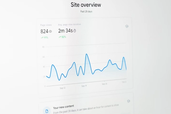
Table of Contents:
What Are Vanity Metrics?
Vanity metrics measure what’s easy, not what matters. They count users, sessions, clicks, taps, and scrolls. These are numbers that rise fast and look great in a chart, but rarely reflect retention, satisfaction, or value. They tell you something happened. They don’t tell you whether it mattered.
They show up early: at launch, during growth sprints, in the first iterations of a dashboard. They’re easy to track, so they’re the first thing that gets tracked. And once they’re in place, they tend to stay there.
Over time, they become habits. A weekly report includes them. A stakeholder presentation highlights them. A team retro refers to them. Eventually, they start driving decisions. Just because they’re the most visible.
And this is how they gain power. Not through accuracy, but through repetition. What ends up happening is that teams build systems around what’s convenient, and then those systems start making the calls.
When Metrics Start Making Calls
Vanity metrics don’t live only in dashboards. They actively shape how teams think, plan, and build. Over time, they alter the way product decisions are made. Usually, without anyone realizing it.
First, they change what teams prioritize. When visibility becomes the goal, features that generate spikes in usage or engagement rise to the top of the roadmap, regardless of whether they create value. Meanwhile, foundational improvements or long-term bets get deprioritized because they don’t move numbers fast enough.
Second, they shift how success is measured. Instead of asking “Did this solve a problem?”, the conversation becomes “Did usage go up?” Teams begin treating correlation as causation. A metric moved, so the feature “worked”, even if there’s no evidence of real impact.
Third, they erode product intuition. When everything is decided by what’s easiest to quantify, product teams stop listening to feedback that isn’t easily measurable. Qualitative signals (support tickets, user interviews, open-ended feedback) get sidelined in favor of cleaner, simpler data. And with that, context disappears.
Over time, the product becomes reactive. Strategy starts to orbit around what’s visible, not what’s important. And teams lose track of who they’re building for.

What Deserves to Be Measured
Not everything measurable is meaningful. But, more importantly, not everything meaningful is easy to measure. Actionable metrics, the ones that tell you whether your product is delivering real value, don’t always look impressive. They don’t spike overnight. They don’t make sexy graphs. But they do tell the truth.
These are some of the ones worth your attention:
Retention: Do People Come Back?
This is one of the clearest indicators of value. If people use your product once and never return, the rest of your metrics don’t matter. You didn’t solve anything.
Good retention metrics reveal patterns. Who’s sticking around? When do they drop off? What behaviors correlate with long-term usage? These are the questions that separate surface engagement from real traction.
Activation: How Fast Do Users Reach Value?
Getting users through the door is easy. Getting them to the moment where the product “clicks” is harder.
Activation tracks whether new users can understand and access the value of your product quickly. If people drop off before doing something meaningful, it’s probably a clarity problem.
Tracking time-to-value or completion of key onboarding actions helps teams see where new users are getting stuck. Or worse, giving up.
Depth of Usage: Are People Using What Matters?
Feature usage can be misleading. Just because something is clicked often doesn’t mean it’s delivering value. Instead, look for sustained, intentional interaction with the core parts of your product.
What features do high-retention users rely on most? What paths lead to repeat usage? These patterns are more telling than raw counts.
Qualitative Signals: What Are People Saying?
The most honest feedback lives in support tickets, cancellation reasons, interview transcripts, and customer calls. Quantitative metrics can tell you what users did. But qualitative data tells you why. And without the “why,” it’s almost impossible to make smart product decisions.
There’s no perfect set of metrics. And no tool will give you absolute clarity. But good metrics do one thing well: they force the right conversations. They help teams focus on what matters even when it’s hard to measure. Even when the numbers are slower to move. Even when the truth is uncomfortable.
How Bad Metrics Break Team Alignment
Teams don’t drift apart because of bad intentions. They drift because they’re reacting to different data.
When product optimizes for feature usage, marketing focuses on acquisition, design tracks engagement, and leadership chases growth curves, each function ends up building toward its own version of success. The problem is that no one’s measuring the same thing. And this results in a busy team that can’t stay aligned.
Initiatives move forward, but not in sync. Roadmaps fill up with disconnected priorities. Progress becomes difficult to define because everyone is chasing metrics that serve their own domain, not the product as a whole.
Shared goals only work if they’re tied to shared signals. And vanity metrics don’t offer that. They’re too easy to misinterpret, too easy to spin, too disconnected from actual value. Without clear, meaningful indicators of progress, alignment becomes performative. Everyone looks like they’re working toward the same outcomes. Until it’s time to make a real decision. That’s when the fractures show.
Ask Better Questions
When teams get stuck in vanity metrics, they stop thinking critically. But asking better questions forces them to slow down, challenge assumptions, and reconnect with the actual product experience.
Here are a few questions that shift the mindset. From chasing motion to understanding impact:
- Would this metric change if we solved the user’s core problem? If the answer is no, then the metric isn’t tied to value. It’s tied to behavior. You can chase engagement all day, but if it doesn’t move when the product improves, it’s not measuring the right thing.
- If this number drops, do we care? Some metrics go up and down without meaning much. Ask yourself: if this fell tomorrow, would it change your priorities? If not, you’re tracking noise. The best metrics create tension when they move in the wrong direction.
- What behavior are we trying to drive, and why? Too often, metrics are reverse-engineered to match what’s easy to measure. Start with the outcome you want: a solved problem, a habit formed, or a pain removed. Then work backward. If the metric isn’t aligned to that behavior, it’s not useful.
- Who are we building for? And is this metric relevant to them? Different users have different definitions of value. Are you optimizing for power users? New users? Paying customers? Casual browsers? A metric without context leads to generic decisions.
- Is this metric helping us make better long-term decisions? A lot of metrics reward short-term wins like conversion bumps, engagement spikes, and A/B test victories. But good products compound over time. A useful metric should help the team learn, not just react. If your data leads to short-sighted choices, it might be optimizing the wrong horizon.
- What’s missing from this dashboard? Maybe the most important one. Every dashboard leaves things out. What’s not being tracked that should be? What question can’t you answer right now? The absence of a signal is sometimes more revealing than the signal itself.
Build for Progress
Real progress can be seen in a roadmap with purpose. In teams that stop chasing spikes and start making deliberate choices. In teams, making clearer decisions. In users who return because the product solved something.
That kind of progress doesn’t come from tracking more. It comes from tracking the right things. Good metrics align teams. They clarify tradeoffs. They surface what’s real, so you can stop optimizing for attention and start building for traction.
That’s the kind of thinking we bring to the table. If your product feels stuck and the data isn’t helping, let’s talk. We work with teams that want clarity, not just code.